When I did my research on the covers for the Dune trilogy, Bruce Pennington’s classic SF cover was the reason I wanted to take up for this project. Despite the fact that the art is somewhat ambiguous in relation to the actual imagery, the classic Sci-Fi of this style of art was something I could not replicate in my design.
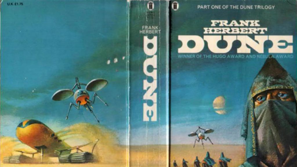
New English Library, 1972.
One other thing is the back cover lacks the presence of blurbs, endorsements, and information, on the author. When that is not necessarily a drawback, some argue that is how a generation of Sci-Fi fans see the books of this genre, while others seem to oppose stating it was a lazy move.
I genuinely love the colors used (teal and tussock), which were also my original design color choices. These colors bring the desert and skyline to life. It’s unusual to find two contrasting colors that also go well together.
Sean O’Connell’s cover art for the 50th-anniversary edition of Dune is my favorite paperback cover design. If I were to pick up a book based on its cover in a bookstore, this would undoubtedly be it. The color palette (bracken, harvest gold, copper, and my pink) complements each other so well that it is visually appealing.
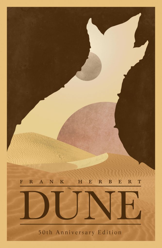
Hodder & Stoughton’s 50th-anniversary edition, 2015.
I read in an article where Sean explains where his thinking behind this imagery came from. As a fan of Dune, he knew the story is about “ecology and the relationship of the desert” with other elements like the planets, the dessert, and the sandworm. Having placed them inside the outline of a sandworm he believed he created “the illusion that you could not focus on one aspect of the image for too long without seeing the other“.
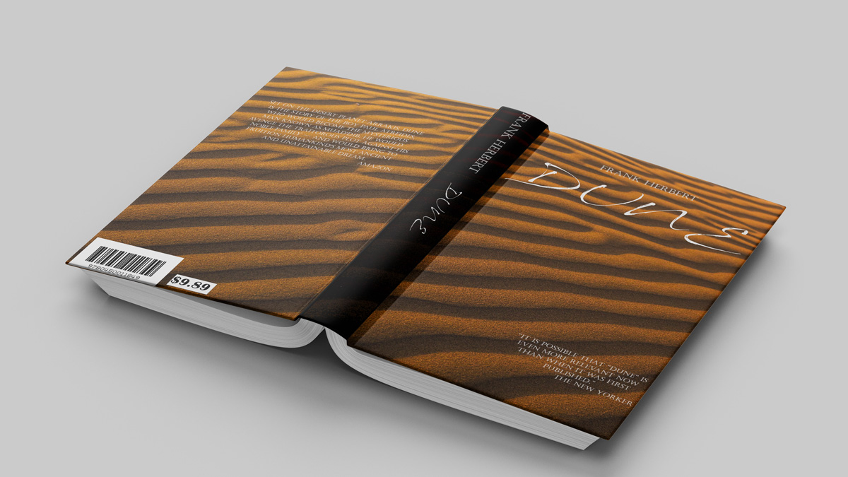
As this would be the first design proposal I created, I did not invest much in the cover art. The thought I had was to create a simple but eye-catchy cover but also to not deviate from the original concepts.
For the image, I used a free image on Unsplash.com. The original photographer is Jeremy Bishop. The inspiration behind using this picture was to create the image of the Dune dessert with ripples made by the sandworms. When I read Dune, these creatures were the most intriguing and fascinating part of the story. I changed the colors here and there to shades of orange of Raw umber, Bourbon, and Brandy punch. There are black ripples visible I used the black color for the spine and had the whole image as a nice wrap-around cover.
White was used for the font since it complements all the other colors of the image.
For the font used Sand Dunes regular for the title and for the author’s name, endorsements (The New Yorker), and the blurb (Amazon) Castellar regular was used.
My final thoughts on my design proposal are as follows: I still have a lot to learn and improve on. In the future, I’ll make my own cover art instead of relying on free images found online.
Without being too critical of my design, I believe I did well as a first-timer. What were your thoughts on it?